Logo Design That Works: A Small Business Owner's Guide to Creating Memorable Brand Identity
Your Logo: The Face of Your New Zealand Business
Look, I'm going to be straight with you - your logo isn't just some fancy graphic you slap on your business cards. It's literally the first thing people see when they encounter your brand, and honestly? It can make or break that crucial first impression.
I've been working with New Zealand businesses for a few years now, and I've seen it all. The good, the bad, and the "what were they thinking?" logos that make you cringe a little. But here's what I've learned: the businesses that really nail their logo design? They're the ones customers remember.
Think about it for a second. When you see that distinctive golden M representing mcdonalds, or the tick for nike, something clicks in your brain, right? That's not an accident. Those logos work because someone put real thought into what they wanted to communicate.
Did you know that people decide how they feel about your brand in just 50 milliseconds. That's faster than you can blink! Whether someone's walking past your shop on Devon street, spotting your food truck in the Liardet street square, or stumbling across your website from Oakura, your logo needs to do its job instantly.
Understanding What Makes a Logo Effective
After designing lots of logos for Kiwi businesses, I've noticed some patterns. The logos that stick around and actually help businesses grow all share a few key traits.
Keep it Simple!!
I can't tell you how many times I've had clients come to me wanting to cram their entire business story into their logo. "Can we add a mountain? And maybe a kiwi bird? Oh, and our phone number?"
NO
The best logos are embarrassingly simple. Apple's got a bitten apple. Nike has a swoosh. McDonald's? Two golden arches. That's it. And guess what? You know exactly which brands I'm talking about without me showing you the logos.
Here's a good test: if you can't sketch your logo from memory after seeing it once, it's probably too complicated. Try it with your current logo right now.
Aim for designs that a child could draw recognizably.
Make it Memorable
Your logo needs to stay in people's heads, but that doesnt mean you need to go completley crazy! I've seen businesses try so hard to be "unique" that they end up with logos that are just too busy and confusing.
The trick is finding that sweet spot where your logo is distinctive enough to stand out but still makes sense for your business. One of my favorite examples is canterburys logo with the three red dots with the negative space in each dot forming a kiwi. Its simple but also clever and easily recognisable.
Some Techniques for Memorability:
Unique color combinations within your industry
Unexpected but relevant imagery
Clever negative space usage
Distinctive typography treatments
Cultural references that resonate with New Zealanders
Think Long Term
Try not to just follow the latest design trends to create your logo, as trends change way quicker than trends you can update all your business cards, signage, and website graphics!
Here are some signs of Timeless Design:
Clean, classic typography rather than trendy fonts
Balanced use of effects (avoiding overuse of gradients, shadows, or textures)
Focus on your business rather than current aesthetic fads
Consideration of how the design will age over 5-10 years
Versatile: Make sure it works EVERYWHERE
Your logo is going to live in a lot of different places. It needs to look good on your massive billboard, your tiny social media profile pic, your black and white fax (yes, some businesses still use fax), and everything in between.
This is where a lot of DIY logos fall apart. They look great on a computer screen but turn into an unreadable mess when you try to embroider them on a polo shirt or print them on a receipt.
Here are some things to check - Does it Work:
Across all sizes: From billboard advertisements to social media favicons
In different color formats: Full color, black and white, and single color versions
On various backgrounds: Light, dark, colored, and textured surfaces
In different orientations: Horizontal, vertical, and square configurations when needed
Is it Appropriate and Matches Your Business Personality??
Your logo should reflect your industry, target audience, and brand personality. For example a children's daycare logo should feel warm and playful, while a law firm's logo needs to convey professionalism and trustworthiness.
Here are some Industry Considerations:
Professional Services: Clean, conservative designs with traditional colors
Creative Industries: More artistic freedom with unique fonts and creative elements
Retail/Hospitality: Welcoming, approachable designs that invite interaction
Technology: Modern, clean designs that suggest innovation and reliability
Logo Types: Choosing the Right Style for Your Business
Not all logos are created equal. Depending on your business, some styles will work better than others.
Wordmarks (Logotypes)
Wordmarks are word based logos which are fantastic if you've got a great business name that people should remember.
Best for:
Businesses with distinctive names
Companies wanting to build strong name recognition
Service-based businesses where personality matters more than symbolism
New Zealand Considerations: Choose fonts that are clearly readable with New Zealand English spelling and terminology. Consider how your business name looks and sounds to local audiences.
Brandmarks (Logo Symbols)
These are icon-based logos that rely on symbols rather than text. This can be really powerful but is risky for small businesses. You need serious marketing muscle to make people associate your symbol with your business. Unless you've got a massive advertising budget, maybe start with something else.
Best for:
Established businesses with strong brand recognition
Companies with long or complex names
Businesses planning significant international expansion
Development Tip: Brandmarks require more time and marketing investment to build recognition, making them more suitable for businesses with a larger marketing budgets.
Combination Marks
These logos combine both text and symbols, offering flexibility in application. Giving you the best of both worlds - a symbol and your business name together. This is what I recommend for most of my clients. You get immediate name recognition while building symbol recognition over time
Best for:
New businesses building brand recognition
Companies wanting maximum flexibility
Businesses operating both locally and nationally
Advantages: You can use the symbol alone once recognition is established, while the text version helps with immediate identification.
Lettermarks (Monograms)
These logos use initials or abbreviated versions of business names and work great for businesses with long names or multiple words.
Best for:
Businesses with long names
Companies with multiple divisions
Professional services wanting sophisticated appearance
Consideration: Ensure your initials don't spell anything unfortunate or confusing in English or te reo Māori.
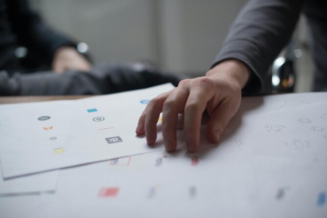
The Logo Design Process: From Concept to Completion
Research and Discovery Phase
Before sketching a single idea, successful logo design starts with thorough research:
Business Analysis:
What are your core values and mission?
Who is your target audience (age, income, lifestyle, location)?
What personality traits should your brand embody?
How do you want customers to feel when they see your logo?
Competitive Analysis:
What do competitors' logos communicate?
What colors and styles dominate your industry?
Where are the opportunities to differentiate?
What approaches are being overused?
Cultural Considerations:
How does your business connect with New Zealand culture?
Are there local symbols or references that might be relevant?
What visual languages resonate with your target market?
Concept Development
Now that the research is complete and you have a thorough understanding of the business and the industry its in you can start with some rough sketches, exploring multiple directions before moving to digital design:
Brainstorming Techniques:
Mind mapping around your business keywords
Exploring visual metaphors for your services
Considering abstract representations of your values
Looking at successful logos outside your industry for inspiration
Initial Sketching:
Aim for 20-30 rough concepts minimum
Don't judge ideas too early in the process
Explore both literal and abstract approaches
Consider various logo types (wordmark, symbol, combination)
Digital Development
Once you have some promising concepts, develop them digitally:
Design Software Options:
Professional: Adobe Illustrator (industry standard for vector logos), Affinity Designer
Accessible: Canva, LogoMaker, or similar online tools for simple designs
Free Alternatives: GIMP, Inkscape for budget-conscious businesses
Technical Requirements:
Create vector versions that can scale infinitely (using tools like canva only create rastor versions)
Develop multiple color variations
Test readability at various sizes
Ensure the design works in black and white
Testing and Refinement
Before finalizing your logo, test it thoroughly:
Technical Testing:
Print at business card size to check readability
View on different screen types and sizes
Test on various background colors
Check how it looks when faxed or photocopied
Audience Testing:
Show concepts to trusted customers or friends
Ask about first impressions and emotional responses
Test memorability by showing the logo briefly, then asking what they remember
Gather feedback from people who represent your target market
DIY vs. Professional Logo Design: Making the Right Choice
Look, I'm a professional designer, so you might expect me to say "always hire a pro." But honestly? That's not always the right answer.
If you're just starting out, have a tiny budget, and run a simple service business where your logo isn't make-or-break, DIY might work for now. There are decent online tools that can help you create something basic and professional-looking.
But here's when you should definitely invest in professional design:
Your business depends on looking credible (anything customer-facing)
You're launching with a real marketing budget
You plan to trademark your logo
You have zero design experience (and that's totally okay!)
If you do go the professional route, ask to see examples of their work for New Zealand businesses. Make sure they understand your industry and target market. And please, avoid designers who don't ask questions about your business - good logo design starts with understanding what you're trying to achieve.
DIY Success Tips:
Study effective logos in your industry extensively
Keep designs extremely simple
Focus on clear, readable typography
Test your design with potential customers before finalizing
Be prepared to upgrade to professional design as your business grows
Choosing the Right Logo Designer
Questions to Ask Potential Designers:
Can I see examples of logos you've created for New Zealand businesses?
What's included in your logo design package (file formats, variations, revisions)?
How do you approach research and strategy in logo development?
What's your revision policy if we need changes?
Do you provide brand guidelines for consistent logo usage?
Red Flags to Avoid:
Designers who don't ask questions about your business
Extremely cheap pricing that seems too good to be true
Portfolios showing only copied or template-based designs
Unwillingness to provide multiple initial concepts
No provision of vector file formats
Implementing Your New Logo Successfully
Getting your logo designed is just the beginning. Now you need to use it properly.
Create some basic guidelines for yourself: How small can the logo go before it becomes unreadable? How much space should surround it? What happens when you need to use it on a dark background?
Roll it out systematically - start with your business cards, website, and main signage, then work your way through everything else.
Protecting Your Investment
Legal Considerations:
Consider trademark registration for unique logos
Ensure you own the rights to your logo design
Keep original design files safely backed up
Document the design process and decisions for future reference
Measuring Logo Effectiveness
Your logo's success should be measured by business results, not just aesthetic appeal:
Brand Recognition Metrics:
Unprompted brand recall in customer surveys
Social media engagement rates
Website traffic increases following logo implementation
Customer referral rates and word-of-mouth mentions
Business Impact Indicators:
Improved perceived professionalism in customer feedback
Increased conversion rates on marketing materials
Higher pricing acceptance from customers
Enhanced employee pride and brand ambassadorship
Your Logo Design Action Plan
Ready to create or improve your business logo? Follow these steps:
Define Your Brand Strategy: Clarify your values, target audience, and desired brand personality
Research Your Market: Analyze competitors and identify differentiation opportunities
Set Your Budget: Decide between DIY and professional design based on your business needs
Create or Commission Your Logo: Follow the design principles outlined above
Test Before Finalizing: Get feedback from target customers and test across applications
Implement Consistently: Use your new logo across all business touchpoints
Monitor and Measure: Track the impact on brand recognition and business results
Remember, your logo is going to be working for your business 24/7. It's worth getting it right. Whether you create it yourself or work with someone like me, focus on making something that genuinely represents your business and connects with your customers.
Your logo should be as hardworking as you are - a visual handshake that introduces your business and builds trust with every Kiwi customer who sees it.